Motive
Brand identity
Concept
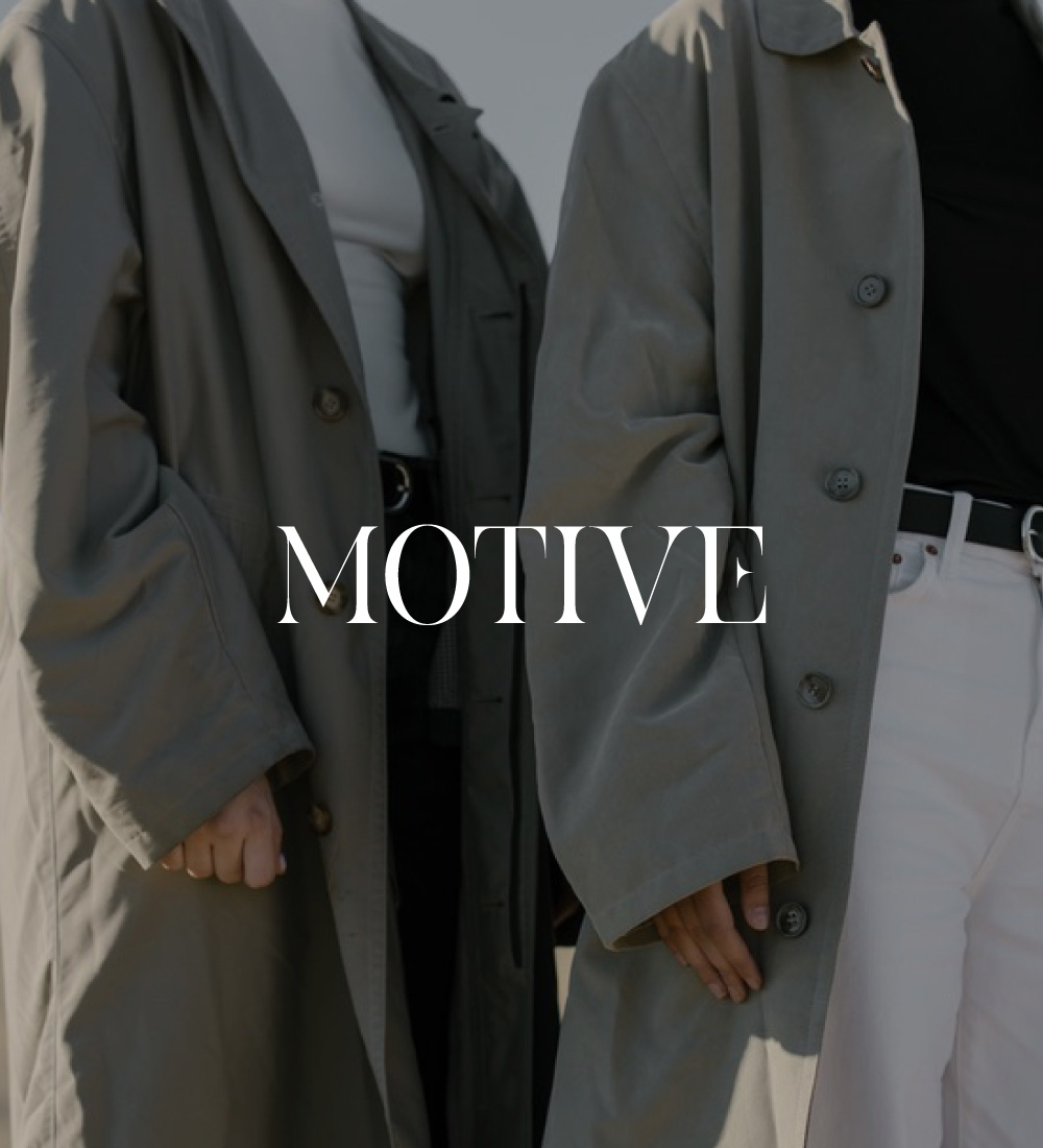
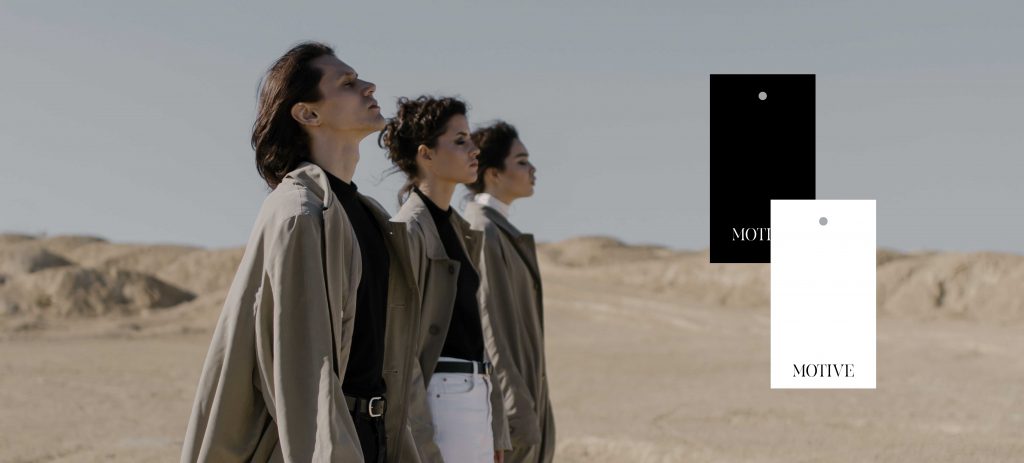
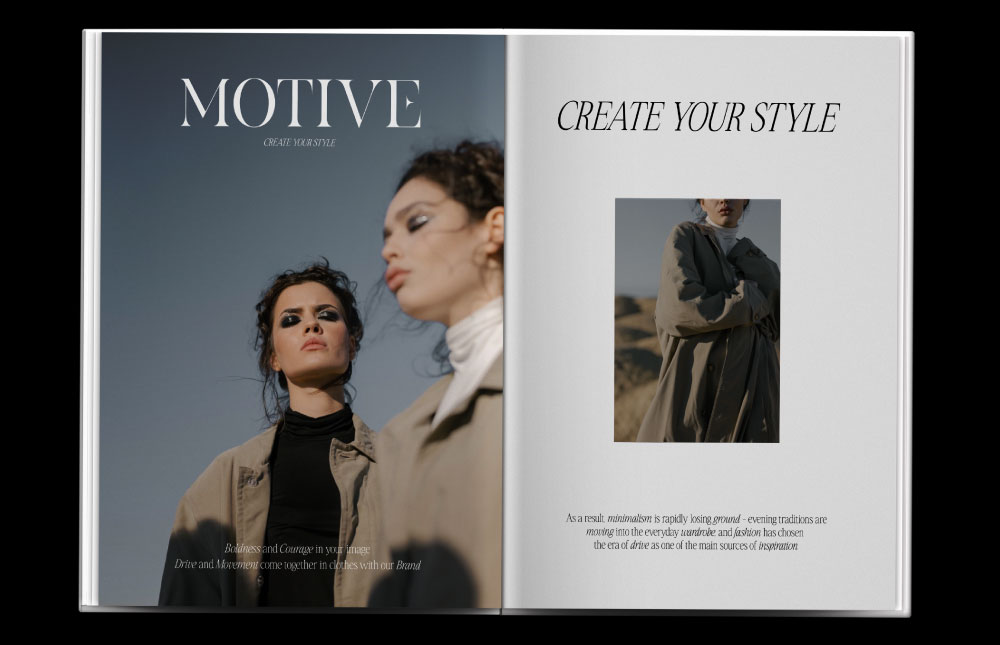
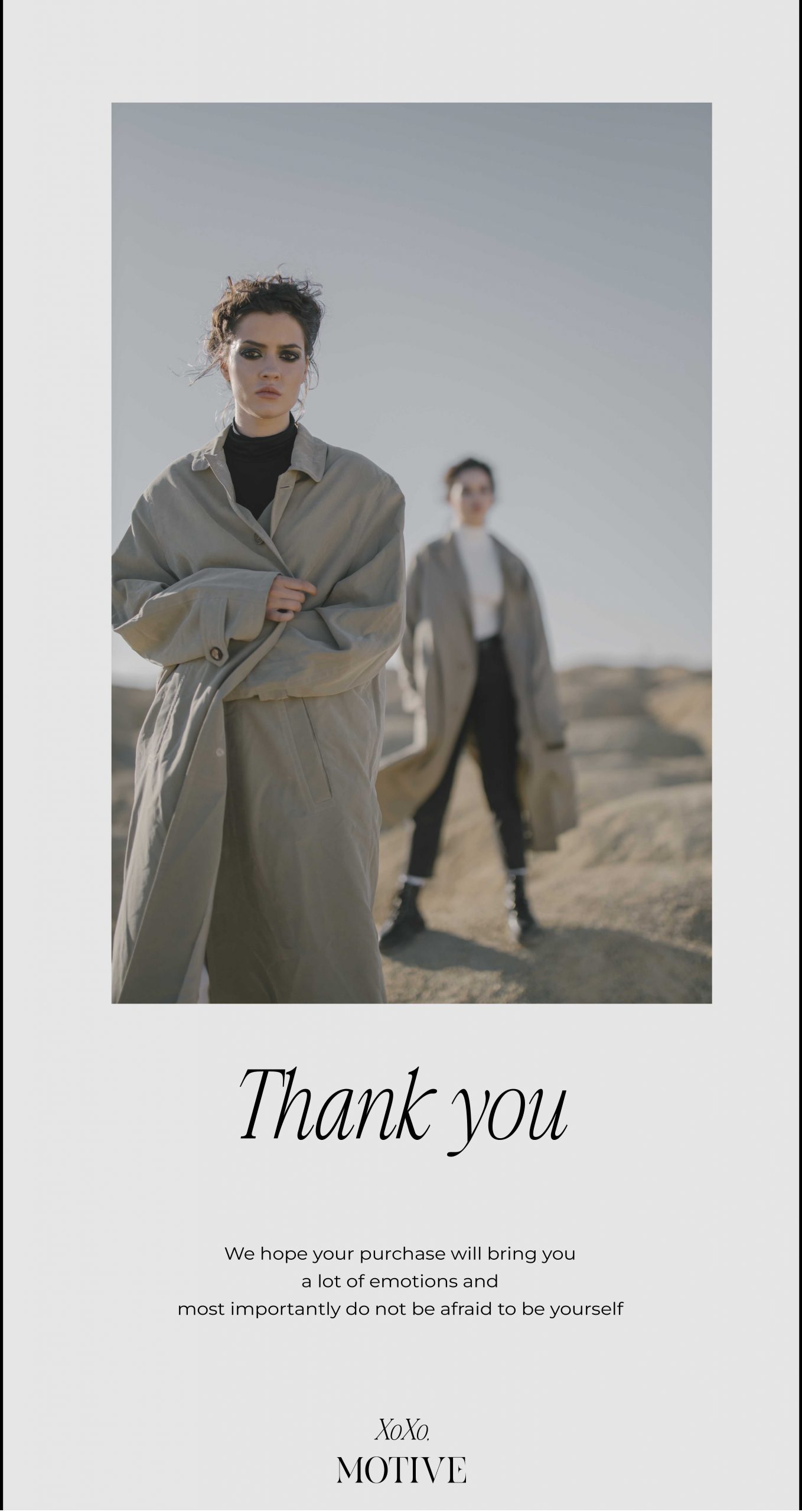
Motive is a Norwegian clothing brand for bold and daring girls. “Create your own style” is the slogan of the brand. Each girl can find here comfortable, bright and at the same time casual clothing. All things are sewn according to a special scheme, allowing them to sit on your figure perfectly. Fashion designer Pauline Schmidt has been doing what she loves for 20 years. She puts her soul into this brand. Therefore, each piece is created by this brand with great attention and care.
The colors of the clothes are chosen so that Luka can be assembled from all the things of the brand without thinking about it. And the chosen fabrics of the best quality look expensive and give a chic look.
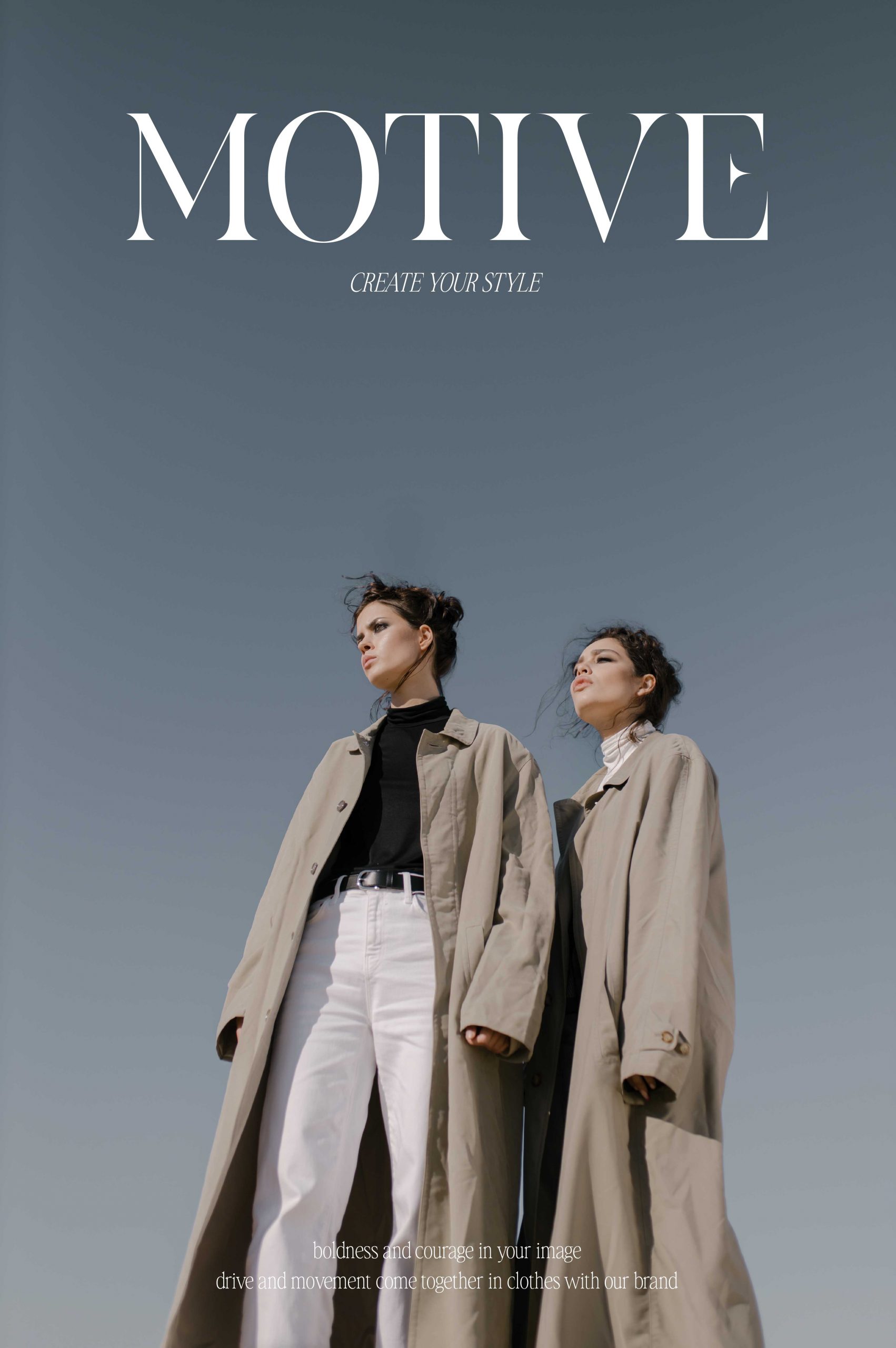
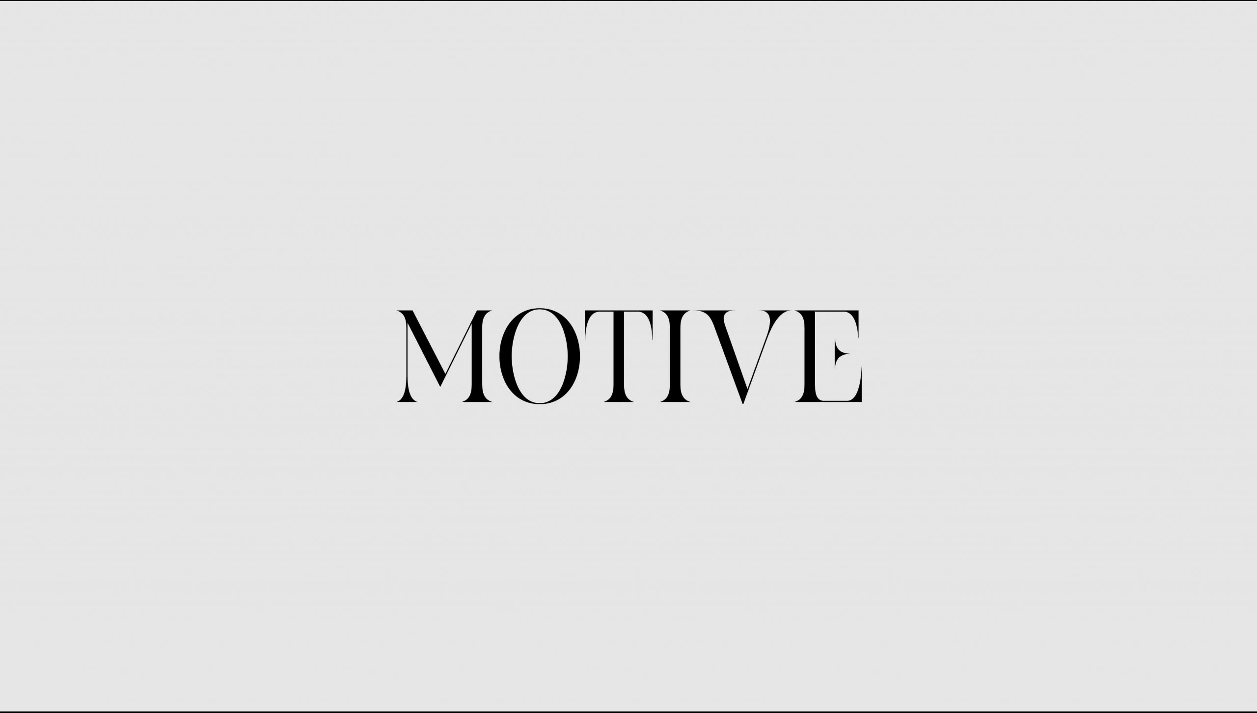
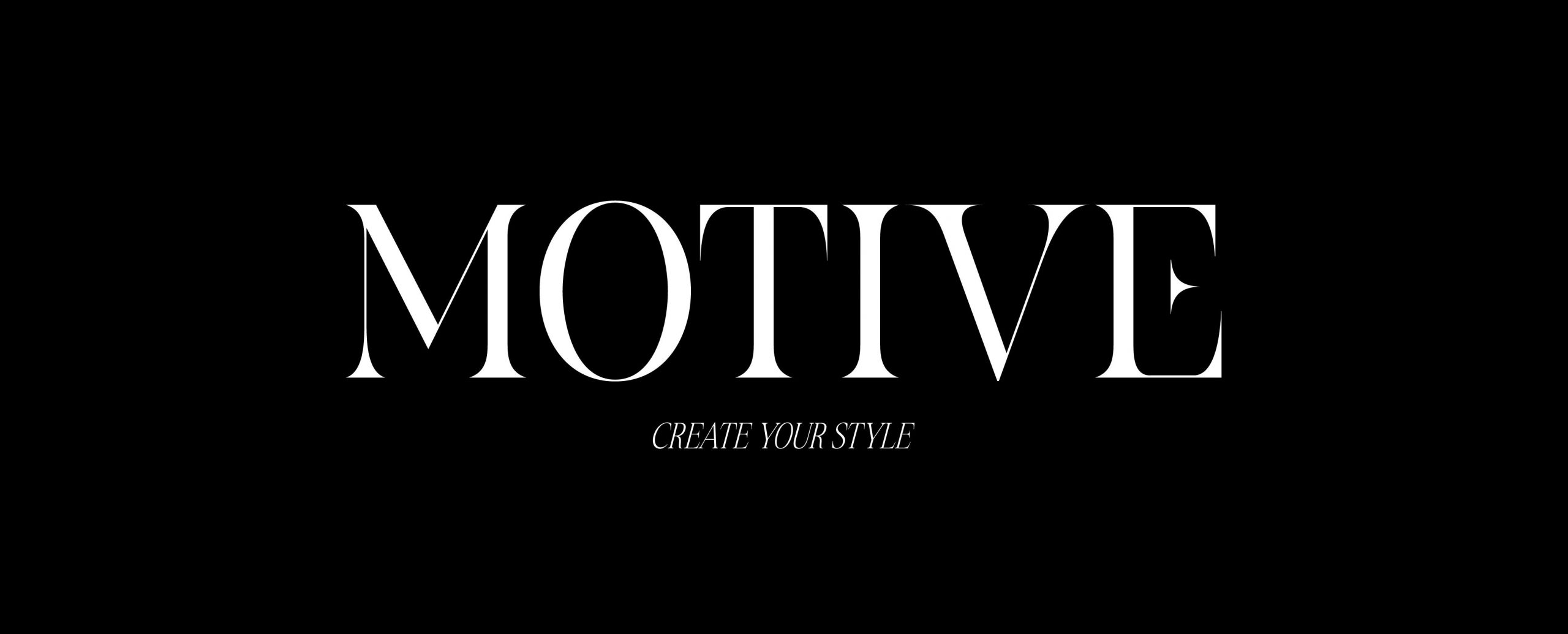
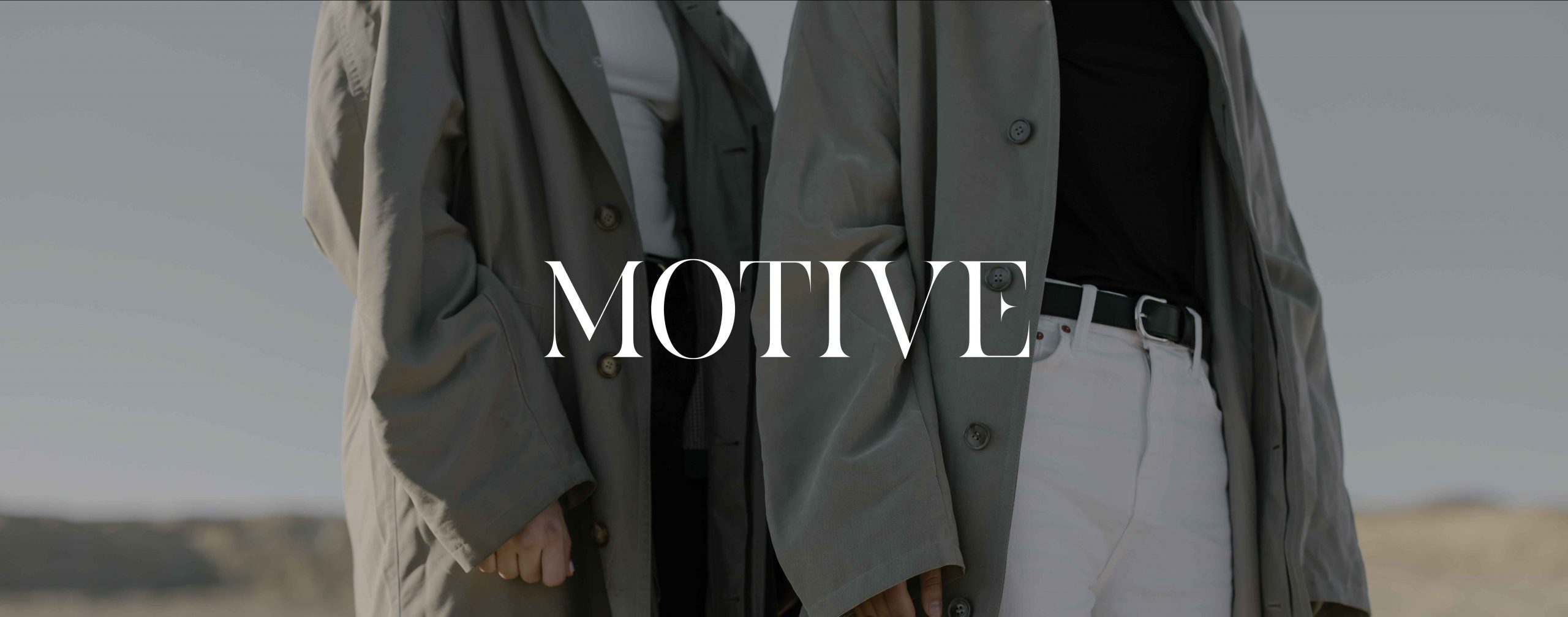
The developed concept of the logo conveys the mood and philosophy of the brand. The individual font chosen specifically for this project was created with classical serifs. The letter E also gives the brand identity and recognition. Thus, we use this letter in the abbreviated version of the logo.

The font itself is massive and eye-catching, while the descriptor is created in contrast to the logo in a light and italicized font. Despite the contrast, the two fonts echo and complement each other. This is how the brand’s philosophy is translated, that each piece is individual and exclusive in its own way, yet perfectly combined in the same look.
The developed concept of the logo conveys the mood and philosophy of the brand. The individual font chosen specifically for this project was created with classical serifs. The letter E also gives the brand identity and recognition. Thus, we use this letter in the abbreviated version of the logo.
The font itself is massive and eye-catching, while the descriptor is created in contrast to the logo in a light and italicized font. Despite the contrast, the two fonts echo and complement each other. This is how the brand’s philosophy is translated, that each piece is individual and exclusive in its own way, yet perfectly combined in the same look.
